UX versus User Interface Design
Home
Dansk
See more:
Mini-course in the method
Some great user interfaces
Microsoft Access tutorial
UX papers
There is a big gap between UX specialists and software developers. UX specialists are good at identifying user needs and testing whether usability of the user interface is adequate. However, they are rarely able to design intuitive and efficient user interfaces. Nor are programmers. There are no systematic design methods. At best, there are guidelines such as "use strong colors to indicate what is important" and "error messages must be friendly".
Dialog first? A popular approach is to design the user dialog first, e.g.: First the user logs in, then he selects what to do. If he chooses x, the system shows ... If he chooses y ... When the dialogue is specified, the programmer designs screens for each step. Sounds right? No - it is a main cause of bad user interfaces. The user struggles with remembering what he did in the previous steps. He may even try to go a step back to check - often with disastrous consequences. (This is related to Piaget's law of object persistence: When you have seen something, you believe it exists - also when you don't see it.) Another disadvantage with this method is that you don't allow the user to deviate from the planned journey.
Data first! In 1994 Lauesen & Morten Harning invented a systematic design method (called "Virtual Windows"). It gives a minimum of user screens, good data overview, efficiency for professional users, and fast development. The basic idea is to design the data screens first (the virtual windows), test with potential users that they understand the data - and modify the screens until they can. Next you add "buttons" to the screens to allow user dialogues. Then you run real usability tests.
The textbook User Interface Design - a software engineering perspective explains the method with several real-life systems as examples. It also reports the results of usability testing, e.g. the 68 defects dealt with during one of the projects: A system for hotel receptionists, handling booking, room allocation, check-in, etc.
The book was written in 2004, where most systems were Windows-based. As a result, most of the examples in the book look "old" today. They are not web-based. However, the Virtual Windows method works just as well for web-based systems.
Book: User interface design - a software engineering perspective - the Virtual Windows method
(Soren Lauesen, Addison-Wesley, 2005, 604 pages): Download sample (pdf)
 How do you make a good user interface - easy to learn and efficient to use? Most books say it is trial-and-error. You reveal the errors with usability testing, but how do you correct the errors? Some are easy to deal with, but in practice many usability defects require major redesign. So making a good first design is crucial. This book shows you how:
- First you have to understand the tasks users will carry out with the new system, and the data involved. The book shows you how to describe tasks and data in a simple, precise way.
- Next you design the Virtual Windows. They are realistic-looking screens that present data. Take care to show realistic data, as well as extreme data. Strive for few screens and a good overview. No buttons or screen navigation at this point. Don't care about dialog and navigation between screens. Test that users can understand the data. Iterate until they can. (Wireframes are somewhat similar to Virtual windows, but pay less attention to realistic data).
- Imagine that the virtual windows are user screens. Walk through the user tasks looking at the "screens". Add the necessary buttons and other functionality to the screens/virtual windows.
- Now you combine the virtual windows and the "buttons" into a mockup or prototype.
- Make usabilty tests: Test that users can figure out how to carry out their tasks on their own. Don't guide them. Revise the design until they can. (Since we checked that users understand the Virtual Windows, this is already quite a good design. Most defects will be easy to correct.)
- Program the system according to the mockup, and test the functionality. This is fun and faster than usual, because you know that the user interface is good.
- Make one more usability test. In priciple, you should have caught all the problems in step 5, but in practice a few are left or came up during programming.
After some training, you can design quite large user interfaces in 2-3 weeks. The book gives three full design examples. Many kinds of systems have been designed this way, for instance systems for intensive hospital care, professional sound measurement, support of newspaper production.
See also examples below: Some great user interfaces
In many cases, data presentation and data entry are easy. It is a matter of showing data from the database with some explanatory texts, such as meaningful field names. In other cases overview of complex data is needed, and data must be presented as graphs, tables, diagrams, etc. Technically, this is difficult, and tools that combine complex data presentations with data entry require hard programming. See Data visualization for a tool where real programming isn't needed.
Mini-course in the Virtual Windows method (Updated 18-10-2019):
Download (pptx)
If you want a quick view of how the Virtual Windows method works, download the PowerPoint show. You should see the slides in presentation mode. Click your way through each slide to see the story. The slides will take you step-by-step through the main design example in the book: a system for supporting hotel receptionists.
Teacher material:
Download (docx)
A suggested course plan (curriculum) for a 12-week course in user interface design. The plan is based on my own experiences during many years of teaching the course. The book contains several training projects and exam questions. Additional training projects and solutions for some of the exercises are available for teachers. Since these exercises are mandatory on some courses around the world, we make sure the solutions are not available on-line. If you are a teacher, contact the author at slauesen@os.dk.
PowerPoint slides (Updated 12-12-2017): Download (zip+pptx)
Contains all the figures from the book. Most of them have some animation. There is one file for each chapter, plus several new slides for Chapter 3 (see additions below).
Pearson Education retains the copyright to the slides, but allows restricted copying for teaching purposes. It is a condition that the source and copyright notice is preserved on all the material. This means that you can show the slides, of course, but also modify the slides and make hand-out copies for teaching purposes, as long as you state the source and copyright notice.
The gestalt law of parallel movement: Download (pptx)
This file illustrates the gestalt law of parallel movement: Things that move in parallel are perceived as belonging together. Download the file and open it in presentation mode (full-screen). You will see a shape (gestalt) moving. As soon as it stops, it disappears. How? (The book explains why. The book illustrates many other gestalt laws, but cannot illustrate this one.)
Additions and misprints: Additions (pdf)
Misprints 2007 (pdf) Misprints 2005 (pdf)
The addition to the book is five new sections for Chapter 3. They explain the typical patterns for showing data from a database (an E/R model), for instance as form-subform, table with detail window, etc.
Some Great User Interfaces
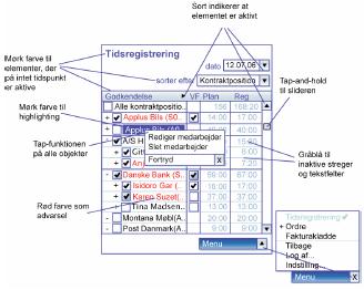
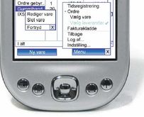 PDA/Smartphone for ISS - 2006
Cleaning duties, inventory and payroll
 Maternity benefit. Used by the parents, the employers (maybe several) and municipalities

User interfaces for PDA and Smartphones
2006: Julie Krogh: Designguide for PDA user interfaces: Download (pdf) in Danish
This is a design guide for systems that support complex, professional tasks by means of PDAs and Smartphones. In 2006 these systems became widely used, for instance to manage facility services in office buildings. The systems had to show a lot of data in a very small space, e.g. cleaning duties, inventory and payroll. Julie's screens are not only efficient to use, they look good too.
The design guide is Julie's master's thesis. She started with some existing applications in ISS (facility services). She studied the cleaners when they worked, and observed what went on at courses for new employees. In this way she identified the basic usability problems with PDA user interfaces. Next she iteratively developed design rules while redesigning the user screens and testing the usability of the new design with several users.
One of the novelties was a simple and space-saving handling of menus, buttons and other functions. They used too much screen space because designers followed the Windows style. Further she had observed that users had big problems finding these functions in the existing systems. She presents her solution in such a way that she introduces the Virtual Windows method at the same time.
Planning maternity leave and allowances
2008: Britt Morelli Hansen: User interface for maternity benefit
The main screen with all data (jpg) Thesis (pdf) in Danish
Prototype (pdf)
This user interface was designed by Britt Morelli Hansen as a Master's thesis. Due to legislation, maternity leave is amazingly complex. Mother as well as father are entitled to paid leave. Their employers pay their salary as usual, and the local municipality pays compensation to the employers. It is not unusual that a mother has 6 employers, all of which have to provide salary information and later get compensation. Sometimes the mother and father live in different municipalities - or the father is replaced by another man during the pregnancy. There are many rules for when leave is possible, whether vacation is allowed, etc.
The user interface deals with all these complexities, is efficient to use, yet elegant. The main screen shows all data, much of it on embedded tab-sheets. The top part shows a timeline of who has leave or vacation. A column indicates how much leave has been used and how much leave is planned. When there are several employers, each of them has a tab-sheet. Tabs are also used in case of more than one father or more municipalities. The screen at the right is part of Britt's paper prototype.
Britt designed a full paper prototype and usability-tested the entire user interface with several mothers, several employers, several officials and several iterations. She wrote and handed in the project report (92 pages). Next she presented the whole thing for the software house that had strugled with the project and challenged her.
They didn't believe what they saw. How long had she worked on this? Answer: 5 months - that is what a thesis project allows. It turned out that 40 developers in the software house had worked on the project for two years - without designing a single user screen. Furthermore, they had given up on serving all the parties in a maternity case (parents, employers and municipalities). In contrast, Britt had designed the system in such a way that all parties could see the same screens and tabs. This was convenient when parties discussed on the phone. However, for privacy reasons, some information was hidden to some of the parties.
The Virtual Windows method was a key part of the solution, and Britt wrote her thesis in such a way that other developers could see how the method worked in this complex case.
Microsoft-Access Tutorial
Soren Lauesen, version 2.4b, July 2011, 154 pages: AccessTutorial (pdf). The tutorial shows examples at the right and the explanation at the left. Make sure your pdf-viewer shows it this way, with two opposing pages and page 2 at the left. You may have to download the tutorial to see it this way.
I have been teaching UX and systematic user interface design from the late nineties to 2016. Students learned to make great user-task descriptions, data models, user interface mockups and usability testing. However, they never tried to implement the database and the user interface. Many tools would be involved to do this in a professionel way. It dawned to me that MS Access was the only tool that could do it all. However, it was hard to learn. Existing documentation wasn't suited. So I spent almost a year learning the details of MS Access, the application screens (Forms) and the programming (VBA). The result was an Access tutorial to be used at the course. It uses a hotel reception system as an example.
We tried it in three semesters, but the conclusion was that it was too much to squeeze into one semester. Furthermore, technology had moved on to html, etc. However, for many years the Access tutorial was the most downloaded document on the IT-University's web-site. And I still (2020) get requests for help from people using the advanced parts of the tutorial. Unfortunately, we still have a gap: There are no other textbooks for teaching implementation of real user interfaces based on a real database. Furthermore, programming teachers cannot design user interfaces, and UX teachers cannot program. Only a few can design a real-life user interface.
The tutorial is still available. Most Access applications today use Access 2010, while the book shows screens from Access 2007. They are similar, but also have confusing differences. The book teaches you how to construct graphical user interfaces with advanced functionality. It covers database creation; user interfaces with windows, menus, etc.; database queries; and advanced user interfaces with Visual Basic. If you want a printed version, print on both sides of the paper, so that text and figure oppose correctly. The figures from the tutorial are available as: Access PowerPoint slides (zip+pptx).
There is also a free Visual Basic Reference card (pdf) (version 2007). Download the file and print it in colors on both sides of an A4 sheet, landscape mode. Fold it along the middle.
Hotel system: User mode (mdb)
Design mode (mdb)
Some readers of the Access tutorial have asked for a demo version of the hotel system. I have made the first functional prototype available (for Access 2007). It works for Access 2010 too, but menu details look wrong. Right-click the links and save the targets somewhere on your local disk. Then open it from there. As a typical prototype, it has many clumsy solutions. After making the prototype, I experimented with Access to find the clean solutions explained in the Access tutorial.
Soren's other UX papers
2014: Soren Lauesen and Mimi Pave Musgrove: Heuristic Evaluation of User Interfaces
versus Usability Testing (pdf). Chapter 14 of User Interface Design - A Software Engineering Perspective, Addison-Wesley 2005, reprint 2007. This chapter compares 17 evaluations of the same user
interface, a hotel booking system for Hotel Pennsylvania, New York. The evaluations
were made by 17 top-level usability teams. Eight teams used heuristic evaluation and nine teams
usability tests. The teams performed very differently, for instance in the number of
problems they identified. We made a careful statistical comparison and showed that there were no significant differences between the two groups. The differences have other causes than the technique used.
2003: Soren Lauesen: Task Descriptions as
Functional Requirements (pdf). IEEE Software 2003, March/April, pp. 58-65. This paper is the first scientific presentation of the task concept, which we invented around 1997.
2001: Soren Lauesen & Morten Borup Harning:
Virtual Windows: Linking User Tasks,
Datamodels, and Interface Design (pdf). IEEE Software 2001, July/August, pp.
67-75. This paper is the first journal presentation of the Virtual Window method, which we invented around 1994.
1998: Soren Lauesen & Houman Younessi: Six styles for usability requirements (pdf). In: Eric Dubois, Andreas L. Opdahl,
Klaus Pohl (eds.): Proceedings of the Fourth International Workshop on
Requirements Engineering: Foundations of Software Quality REFSQ’98, Presses
Universitaires de Namur, pp. 155-166.
1998: Soren Lauesen: Usability requirements in
a tender process (pdf). In: Paul Calder & Bruce Thomas (eds.): OZCHI’98
Conference Proceedings, IEEE Computer Society, pp. 114-121.
1997: Soren Lauesen: Usability engineering in industrial practice (pdf). In Howard et al. (eds.): Human-Computer Interaction, Interact'97, Chapman & Hall, pp. 15-22.