content="text/html";charset="utf-8"
Data Visualization, End-user Development and EHR
Home
Fig. 1: Two screens from a health record system
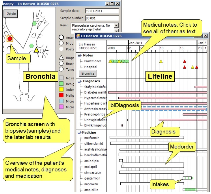
Fig. 2: Property grid for the Sample icon
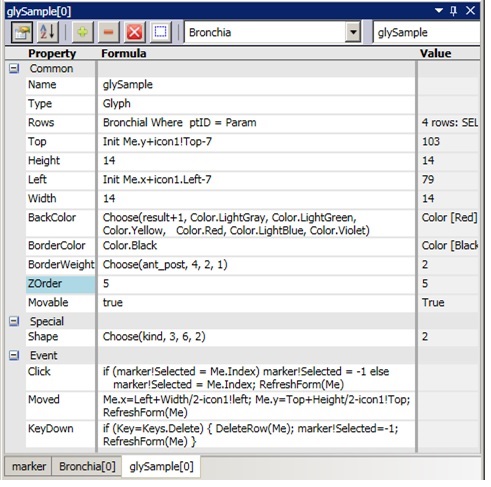
Fig. 3: The developer toolbox
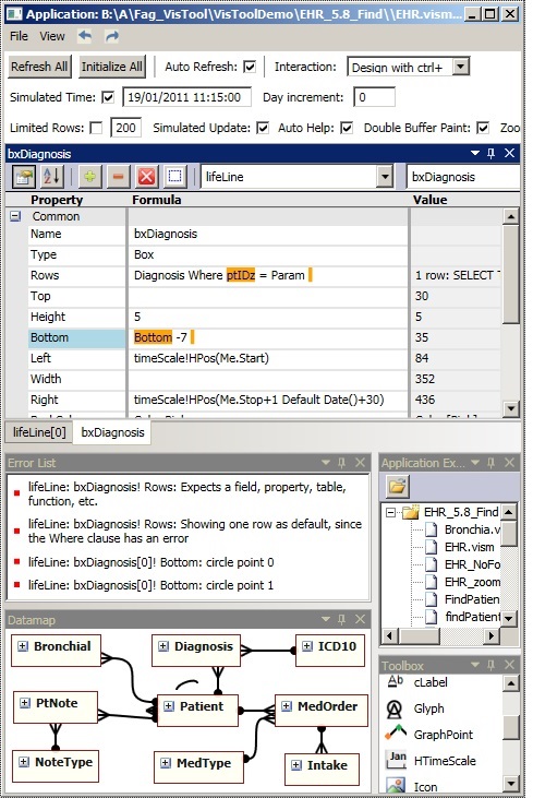
Fig. 4: Health record with lab results and patient services
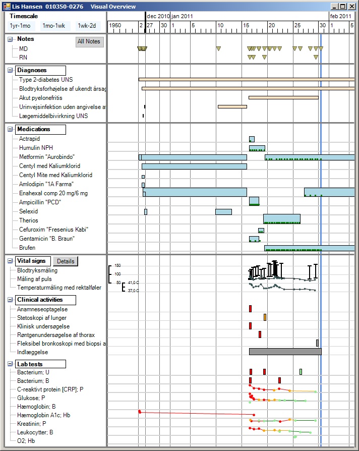
Fig. 5: Order medicine
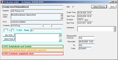
Fig. 6: Give medicine - nurse task
The Uvis tool
In work areas with many user groups such as hospitals, all groups would share a common database. However, each group may need their own complex user screens. Ideally, they should be able to create their own screens, but at present heavy programming is needed to do so.
The Uvis tool allows IT-interested users to develop screens that visualize and interact with data from existing databases. "Programming" the screens is done with formulas similar to spreadsheet formulas. The screens can make up a stand-alone system or an extension of an existing application. Uvis can combine visualizations with data shown in traditional ways. The end-user can interact with clicking, typing, dragging, etc. We implemented the tool and used it to develop an electronic health record system (EHR) with advanced data visualization: Visualization of health records (pdf, 2015)
Visualization with formulas (pdf, 2013)
Try the Uvis tool
You can download a free trial version for MS Windows: UvisTrial.zip. The zip-file contains the development tool, the EHR database, the screens, and documentation. You can see the Readme file here: Readme file. There is a reference card with this content: Uvis Reference Card. It explains the uVis language.
Open the Readme file to see how to install and run uVis, design screens, etc.
Source code is available here: Uvis Source.
Troubles? Mail me at slauesen@os.dk
Health Record example
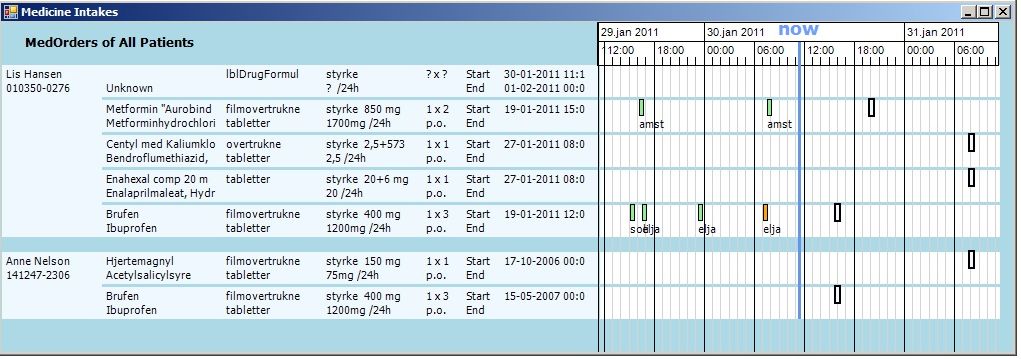
Figure 1 shows two screens made with Uvis, one with a patient's medical lifeline, and one with a diagram of the bronchia where icons indicate where the doctor took samples. On the Lifeline screen, the doctor can see how the patient's diseases (diagnoses) and medications (Medorders) extend over time. The height of a MedOrder bar indicates the daily dose of the medicine. You can drag the time scale at the top to zoom in and out. In the top ribbon (notes), icons (triangles) indicate when doctors wrote notes about the patient. You can click an icon to see the text or double-click to see a traditional list of doctor's notes.
The Lifeline screen was developed in 8 hours by a person who knew Uvis well and knew the relational database behind. We made it early 2012 as the first functional prototype of a health record system.
The Bronchia screen was designed two months later by a heart surgeon, who often made bronchoscopy. He wanted a diagram of the bronchia where he could indicate where he took samples, how the samples were taken and what the later lab results showed. He can enter this data by clicking on the diagram to create a sample icon, and on the "icon buttons" at the right to make the icon indicate which kind of sample. He can enter traditional text about the sample in the text boxes. This screen was developed in 6 hours.
Developing with Uvis is basically the same as with many other tools: The developer drags a visual component to the screen and a property grid pops up, showing properties of the component, such as top, left and color. Figure 2 shows the properties for the Sample icon from Figure 1. The novelty is that the properties can be complex formulas that compute top, color, etc. from properties in other components and from data base contents.
The Rows property specifies how many component instances to create. In the example, Rows is a query to the database. It says that Uvis has to retrieve rows from the Bronchial table. It must be rows with a patient ID matching the patient ID of this patient (Param). Uvis will then create a Sample icon for each of these rows. The icon position, shape and color depend on data in the row. In Figure 1 there are 4 samples. The Top property of a Sample icon computes its value as the "y" field in the database row (Me.y) relative to the top position of the diagram (icon1!Top).
The entire Lifeline screen has 8 components with a rows property, one that generates all the diagnosis boxes, one for all the diagnosis names at the left, etc. The screen shows in 0.7 seconds on a standard PC. It draws on a public table of 22,000 possible diagnoses and a public table of 5,000 types of medicine.
The property grid is part of the Uvis toolbox, shown in Figure 3. As a developer, you can see part of the datamodel, part of the file directory, etc. You can also give the system under test a simulated date-time, which is convenient when you test systems that have date-time fields in the test database. The system you develop may comprise several screens (Forms). They are not inside the toolbox, but directly on the computer screen. You can put the toolbox in a "corner" of the screen - or on screen 2.
All medical data
As part of the project, we developed our own version of a full health record database - just to prove that it is possible to cover medical data from all specialties with a small number of tables.
In 2014 our health record database included all kinds of medical information: 17,000 kinds of lab tests, 17,000 kinds of clinical activities (including X-ray pictures, etc.), tables of clinical users and organizations. The table of medicine types is now supplemented with a table of 13,000 drugs with trade names. Patient-specific data is covered by 10 tables. One thing we don't try to cover is billing and accounting. In total the system comprises 26 tables, including simple tables such as a list of urgency codes.
Figure 4 shows a lifeline that covers all medical data for a patient, including lab tests and other kinds of service. Services with numerical results are automatically shown as a simple line graph, other services as boxes. Some services can be shown in a special way when you click their box. The bronchial screen above is an example of a "special way". New special presentations can be added on a departmental basis. There are screens for ordering medicine (Figure 5) and giving medicine (Figure 6), ordering services, etc. In total around 20 screens, all made with Uvis formulas.
The future of Uvis
Uvis is based on Lauesen's ideas early 2006. In 2007 we got funding for a project that would develop Uvis and prove that it could be used for health records with local customization in the hospital departments.
When we started the Uvis project in 2007, we based it on Windows .NET. At that time, the web was not suited for data visualization. This changed during the project with the arrival of HTML 5.
In 2011 we had an operational prototype of the entire system, and we had tested that IT-interested end-users could use it for development. We had shown Uvis to several suppliers of health record systems and to some software houses. They could see the potential, but their present focus was expanding their products with web and mobile user interfaces. It wasn't obvious how Uvis could be ported to these platforms. Some of the companies said that if the system had been for the web or a mobile platform, they would use it right away.
We hope that someone takes up Uvis or the ideas, implement them on the web, and use them in real products.
Anonymizing a health record database
As part of the uVis project, we anonymized a relational database of 300,000 health records. See:
Anonymizing health records and
Preserving medical correctness (pdf, 13 pages, 2016)
Working papers
Uvis Reference Card. Print on both sides and fold: Download (pdf)
2013: Soren Lauesen: Customizable Data Visualization with Uvis. Example: Electronic Health Record. 10 pages: Download (pdf)
2013: Soren Lauesen, Mohammad A. Kuhail, Kostas Pandazos, Shangjin Xu, and Mads B. Andersen: Uvis - Visualization and interaction with a drag-drop-formula tool, 16 pages: Download (pdf)
2012: Soren Lauesen, Mohammad A. Kuhail, Kostas Pandazos, Shangjin Xu and Mads
B. Andersen: Extending applications with visualization, 9 pages: Download (pdf)
2012: Soren Lauesen, Mohammad A. Kuhail, Kostas Pandazos, Shangjin Xu and Mads
B. Andersen: A drag-drop-formula tool for custom visualization, 10 pages: Download (pdf)
2009: Soren Lauesen: VisTool (later: Uvis) for data visualization, 18 pages. This is the original document that described the principle and visions behind the tool.: Download (pdf)
2009: Soren Lauesen: Requirements specification for VisTool (later: Uvis) - a development tool for complex data visualization, 51 pages. This is the original requirements specification for the tool: Download (docx).
Ph.D. theses
2013: Kostas Pantazos: Custom Visualization without Real Programming, 207 pages: Download (pdf)
2012: Mohammad A. Kuhail: Custom Formula-Based Visualizations for Savvy Designers, 147 pages: Download (pdf)
2012: Shangjin Xu: VisTool - A user interface and visualization development system, 132 pages: Download (pdf)
Peer-reviewed papers
2016: Kostas Pantazos and Soren Lauesen: End-User Development of Visualizations, 10 pages. Journal of Imaging Science and Technology, 60(1): 010408-1-010408-10, 2016: Download (pdf)
2016: Kostas Pantazos, Soren Lauesen and Soren Lippert: Preserving medical correctness,
readability and consistency in de-identified health records, 13 pages, Health Informatics Journal, DOI: 10.1177/1460458216647760: Download (pdf)
2013: Kostas Pantazos, Mohammad A. Kuhail, Soren Lauesen, Shangjin Xu: Uvis Studio - An Integrated Development Environment for Visualization. In Proc. of Visualization and Data Analysis, page 15-30, 2013: Download (pdf)
2013: Mohammad A. Kuhail, Kostas Pantazos, Soren Lauesen: The Inspector: A Cognitive Artefact for Visual Mapping. Proceedings of IVAPP 2013.
2012: Kostas Pantazos, Soren Lauesen: Constructing Visualizations with InfoVis Tools - An Evaluation from a User Perspective. In Proc. of GRAPP/IVAPP, page 731-736, 2012: Download (pdf)
2012: Mohammad A. Kuhail, Soren Lauesen: Customizable Visualizations with Formula-linked Building Blocks. In GRAPP/IVAPP, pages 768-771, 2012.
2012: Mohammad A. Kuhail, Kostas Pandazo, Soren Lauesen: Customizable Time-Oriented Visualizations. In ISVC (2), pages 668-677, 2012.
2012: Mohammad A. Kuhail, Soren Lauesen, Kostas Pantazos, Shangjin Xu: Usability Analysis of Custom Visualization Tools. In SIGRAD 2012 proceedings, pages 19-28.
2011: Kostas Pantazos, Soren Lauesen & Soren Lippert (2011):
De-identifying an EHR database - Anonymity, Correctness and Readability of the Medical Record. Proceedings of MIE2011: Download (pdf)
2011: Kostas Pantazos: Engaging Clinicians in the Visualization Design Process - Is It Possible?: In Proc. Workshop on Visual Analytics in Healthcare (VAHC) in conjunction with IEEE VisWeek, page 40-43, 2011: Download (pdf)